Keep the status clear when the red cue changes
Protanopia: Make Red States Readable Beyond Color
Quick answer
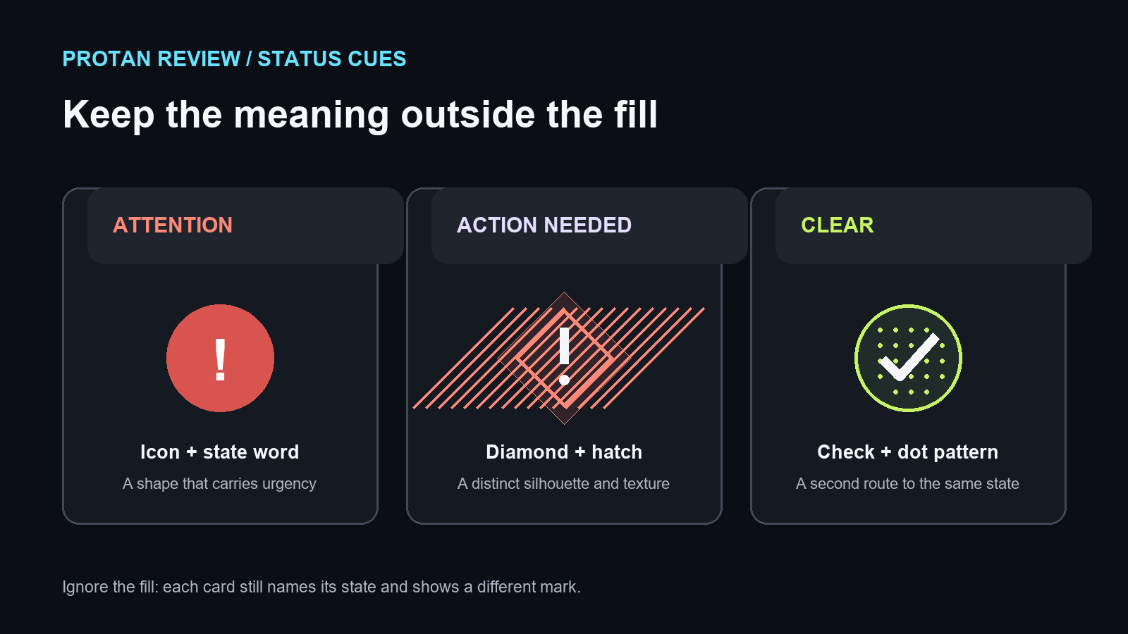
A protanopia review passes when the task still works without identifying red.
Choose one real screen and name the decision its red cue is meant to signal. Preview the same source with the simulator’s Protan control, then check whether text, shape, pattern, line style, or position still carries that decision. This is a design check for protanopia and protanomaly examples, sometimes searched as “protanopia color blindness”; it cannot predict every viewer’s vision or diagnose anyone.
Do this now: pick one red alert, chart series, or map route. Record what it means, hide or ignore its color, and add a second cue before comparing the revised screen under the same preview settings.
Run the red-state checkRead the preview as a design signal
The Protan control applies a simulation model to an image. A changed red region is a reason to inspect the task, not proof that every person with protanopia sees that exact result. The site offers Brettel’s 1997 full dichromacy model, Viénot’s 1999 protan/deutan comparison model, and Machado’s 2009 severity-specific model; these method labels describe the transforms used here.
Keep the source image, crop, viewing size, and model setting fixed while comparing a repair. If two methods suggest different trouble spots, write down the disagreement and keep the interface cue clear in both previews instead of choosing whichever output looks reassuring.
Search results explain the condition; the missing piece is a repair record
Google US natural results checked on September 25, 2026 surfaced protanopia definitions and color-confusion explanations from Colblindor and Pilestone, alongside DaltonLens simulation and method pages. Those results orient a reader to the label and preview. They do not give a protanopia-focused record for a real status, chart, or route that captures the blocked decision, repair, and controlled retest.
This guide fills that practical gap with a task-first check. The search snippets were used to identify the current page topics, not as evidence for medical or performance claims.
A historical seating-plan example is context, not a protanopia finding
An archived Etre simulator page captured in 2012 named theatre seating plans as one example of users being unable to distinguish sections that were separated by color. That page did not identify which color-vision condition was involved. It supports a general design question—can a reader locate the intended section without its hue?—but it is not a protanopia-specific study or a result produced by this site.
Carry the question into a current map, schedule, or interface, then check the actual task with an explicit second cue. Do not carry the old example forward as evidence about every viewer or every palette.
Red-state check: write down the meaning before the color
| Component | Decision to preserve | Failure to look for | Second cue to test |
|---|---|---|---|
| Status or alert | Is action needed, or can work continue? | The state is shown only by a red fill or border | Short status text plus a distinct icon or edge shape |
| Chart | Which value belongs to the flagged series? | Red is the only way to track a line or point | Direct label, dashed line, or a distinct point marker |
| Map or seating plan | Which route, section, or zone should be chosen? | Adjacent regions differ only by hue | Named region, patterned area, boundary, or route symbol |
| Form | Which field needs correction? | An error appears only as a red outline | Linked message and an error icon beside the field |
| Legend | Which mark maps to each category? | A reader must match small color swatches | Place labels beside marks and vary line or marker shape |
Test the decision in the middle column before tuning the palette. A repair is useful only if its extra cue identifies the same state without a color-name guess.
Check luminance and contrast in the actual component
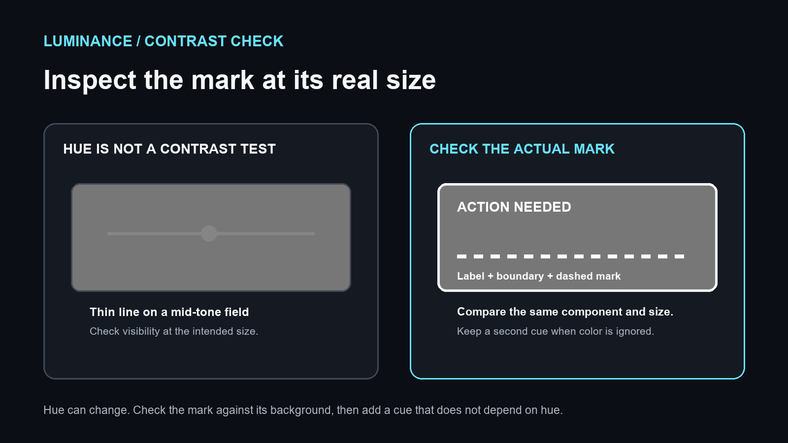
Protan previews can make some red regions appear less prominent in a particular image. Inspect the foreground mark against its background at the size people use; do not assume that changing hue alone fixes visibility. A brighter warning fill can still leave a thin icon, small text, or adjacent chart lines hard to pick out.
Start with readable text and clear boundaries. Then add a shape, pattern, direct label, or line style that survives when color is ignored. Compare the repaired component in the same preview and at the same display size. Treat any luminance or contrast result as specific to that tested screen and setup.
Controlled example: a red-only release alert
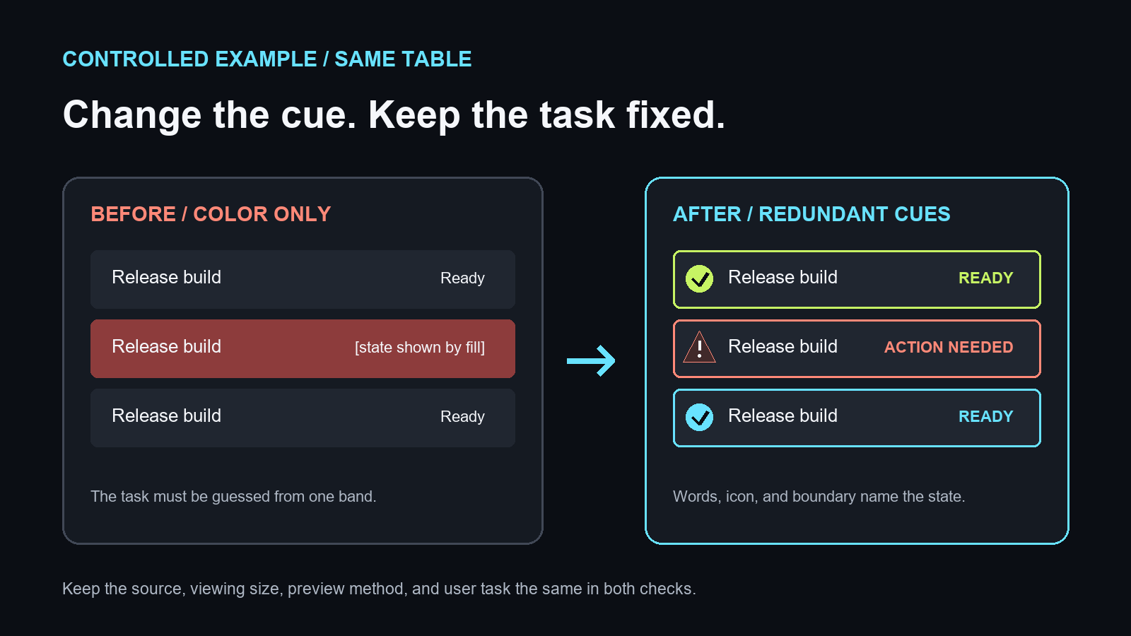
Begin with a release table where a red band is the only sign that a row needs attention. Save the source at its intended viewing size and run the Protan preview. Record whether the task can be completed from the row itself; do not infer an outcome from the hue shift alone.
Add the words “Action needed,” pair them with a warning symbol, and give the row a strong boundary. Run the same image through the same method and compare the task again. If the state is now clear from the words and symbol with the fill ignored, the design has a second channel in this check.
This is a site-authored method example, not a user study. It tests whether one interface state remains identifiable under the selected preview and viewing conditions.
Repair in an order that keeps the result readable
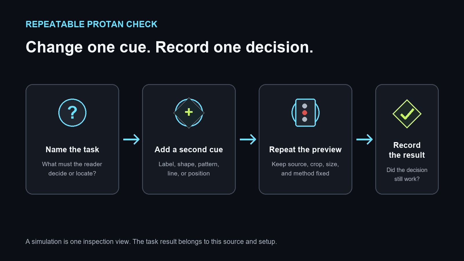
- Name the task and the state, series, or region the cue identifies.
- Add a direct label or icon where a reader makes that decision.
- Use line style, pattern, shape, or a clear boundary to separate nearby items.
- Check text and important marks against their backgrounds at the real display size.
- Repeat the same task with the same source, crop, viewing size, and simulation method.
If the outcome changes when the simulation method changes, keep the finding method-specific and improve the cue until the decision no longer depends on the preview alone.
Protanopia review worksheet
| Field | Record this observation |
|---|---|
| Screen and user task | ____________________________ |
| Meaning carried by red | ____________________________ |
| Source, crop, and viewing size | ____________________________ |
| Protan control and selected method | ____________________________ |
| Decision that became unclear | ____________________________ |
| Second cue added | ____________________________ |
| Result after the controlled retest | ____________________________ |
Keep before and after captures with the notes. A changed crop, size, method, or task starts a separate record.
Sources and limits
Google US natural results for protanopia were checked in the signed-in Chrome profile on September 25, 2026, against Colblindor, Pilestone, and DaltonLens. The result snippets surfaced condition descriptions and simulator or method pages. Those snippets were used to check topic coverage; competitor pages were not treated as fully read sources for clinical claims.
The archived Etre simulator page in the December 31, 2012 Wayback snapshot mentions theatre seating plans as an example of color-separated sections that some users could not distinguish. Etre did not specify a condition for that example. It is included here only as a historical design context, not as a protanopia study.
The decision table, status-card example, repair order, and worksheet were created for this site. The simulator is a visual design aid; it is not a diagnosis or a guarantee of how an individual sees color.