Printable model preview · US Letter · static PNG
Color Blindness Chart: Print a Labeled Simulation Guide
Quick answer
Download the chart, then follow each labeled shape across the model rows.
This original color blindness chart is a static, print-sized comparison sheet made for design review. It labels protan, deutan, and tritan model views, keeps every sample tied to a letter and shape, and marks its grayscale preview separately. Use it to inspect chart cues; it is not an eye test, screening plate, or personal diagnosis.
Download the printable PNG Print-ready PDF
Print now: choose “Actual size” or “100%” on US Letter paper; keep “Fit to page” off so the stated paper size is preserved.
Color chart: compare the same four marked samples in every row
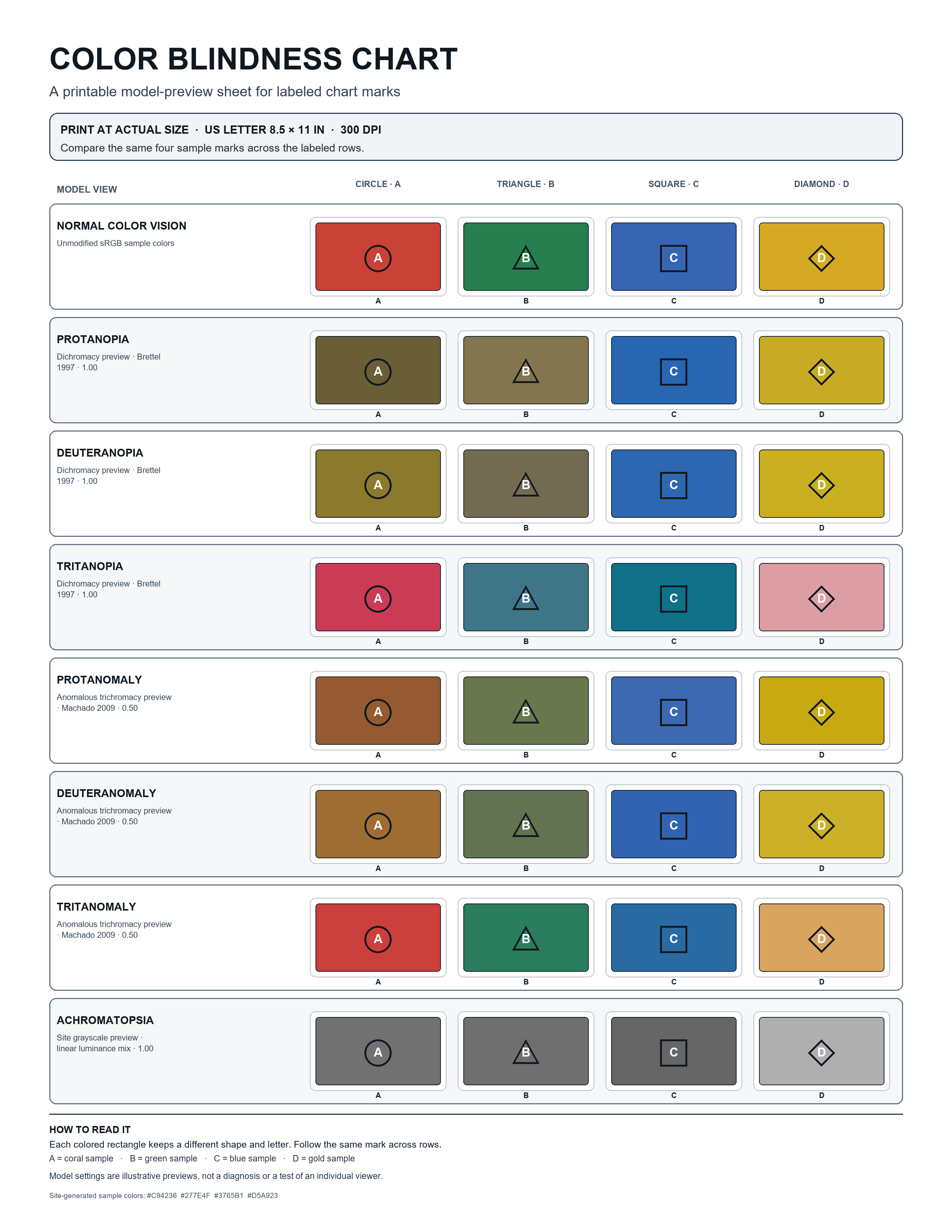
The four sample fills are site-generated sRGB swatches. Their letter and marker shape stay attached to each sample, so a grayscale print still shows which series is which. The model rows are preview settings used by this site; they do not predict how a particular person sees a color.
Read the protan, deutan, and tritan type labels
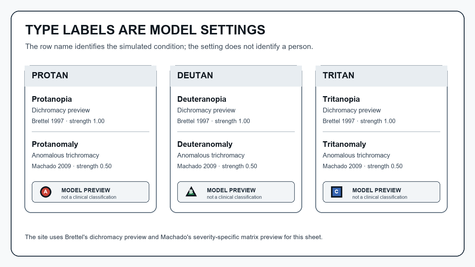
The type key keeps each simulator mode explicit. The site applies its Brettel 1997 projection preview to the three “opia” rows and its Machado 2009 severity-specific matrix preview at 0.50 to the three “omaly” rows. These are named model settings selected for a side-by-side illustration, not measurements or prevalence claims.
Keep labels beside the marks in the actual chart
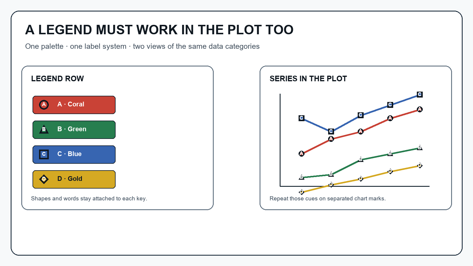
A neighboring swatch row and a finished data chart are different layouts. Put the series name beside a line, repeat a symbol at data points, or use a distinct dash or fill pattern. A 2002 archived design guide specifically named bar charts, maps, and navigation bars when recommending texture, line shading, or written labels instead of color-only regions.
Use a color blindness chart as a design check, not a color eye test
If you searched for a “color eye test chart” or “colour eye test chart,” this printable sheet has a different job: its simulated rows show how this site transforms a small set of design swatches. It cannot screen a viewer. The phrases “color chart color blind” and “colour blind colour chart” can also refer to design references; use this file only for the labeled design-preview task described here.
A commenter discussing a chart that was hard to follow wrote, “Three different shapes with different sizes along with the colors would have been better.” This sheet pairs each color with both a letter and a distinct shape, then the workflow below takes that cue into the actual plot.
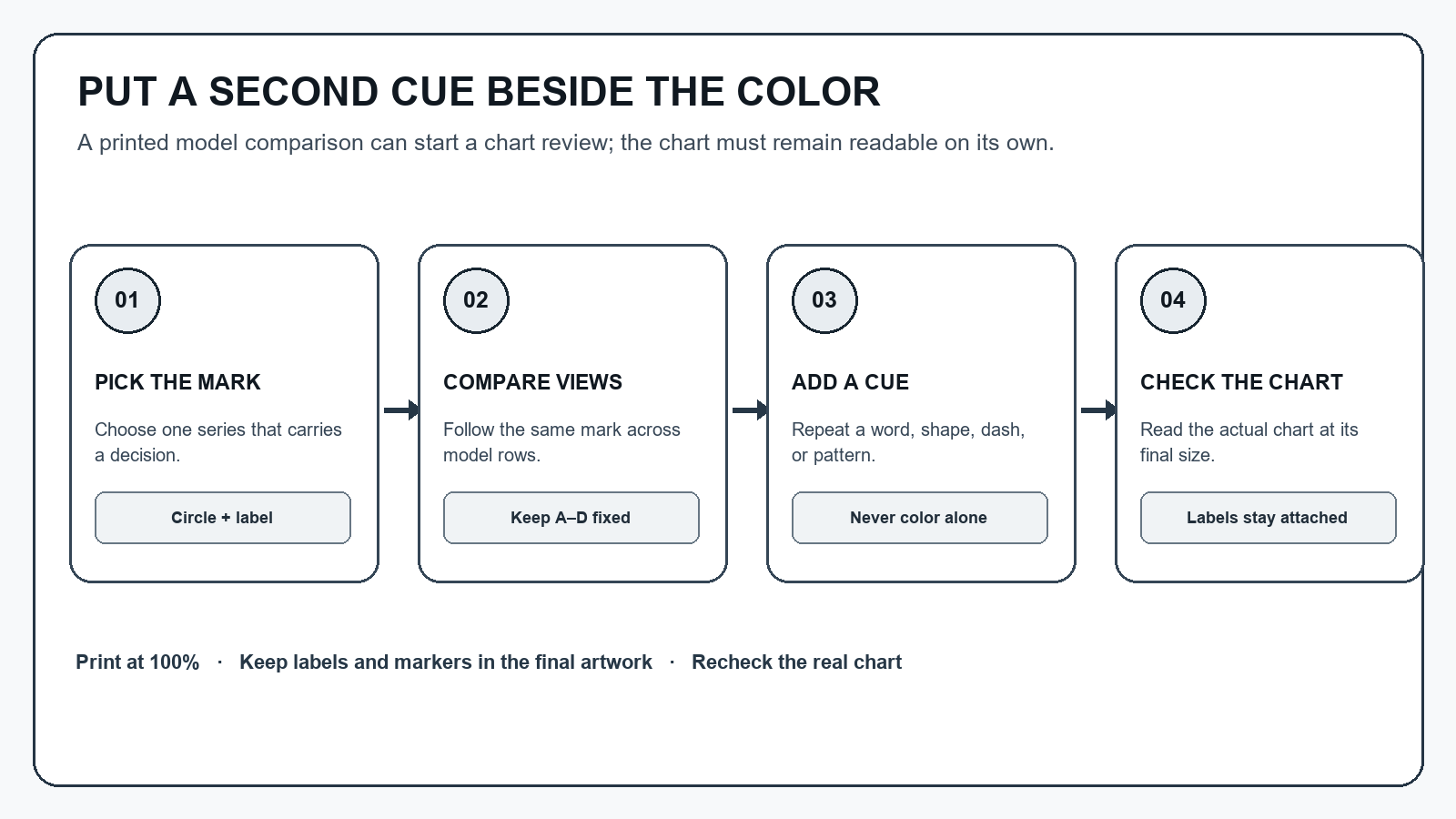
Printable chart review worksheet
Record the chart you reviewed and one concrete change. This small checklist is for the design file, not a viewer’s test result.
| Design review note | Write before release |
|---|---|
| Chart, page, or exported figure | ____________________________ |
| Important series or category | ____________________________ |
| Preview row and stated model setting | ____________________________ |
| Second cue attached to the marks | ____________________________ |
| Actual-size print or screen check | ____________________________ |
| Change made and next reviewer | ____________________________ |
- Choose one chart category that carries a decision.
- Follow its letter or shape across the printed model rows.
- Add a direct label, symbol, line style, or pattern to the real chart.
- Check the finished figure at its intended size and against its background.
Source and limits
This site-made chart uses the simulator’s existing color transforms and four original sample swatches. Its Brettel dichromacy and Machado anomalous-trichromacy previews are descriptions of implemented model choices; the grayscale row is the site’s luminance preview. A simulation can help review a design, but this sheet does not establish anyone’s type of color vision or clinical status.
The chart-cue advice is attributed to a February 2002 archived design guide; the simulation-method citations above name Brettel, Viénot & Mollon (1997) and Machado, Oliveira & Fernandes (2009).