A preview can show a pattern, not another person’s view
What Do Colorblind People See? Compare the Patterns Carefully
Quick answer
Most people with color vision deficiency see color, but some color differences are harder to tell apart.
The exact experience varies with the type and the individual; there is no single image that represents every colorblind person. To inspect a design, open one representative image in the simulator, choose a view, and compare Original, Simulated, and Difference. That output is a model-based design preview, not a portrait of someone else’s vision or a diagnosis.
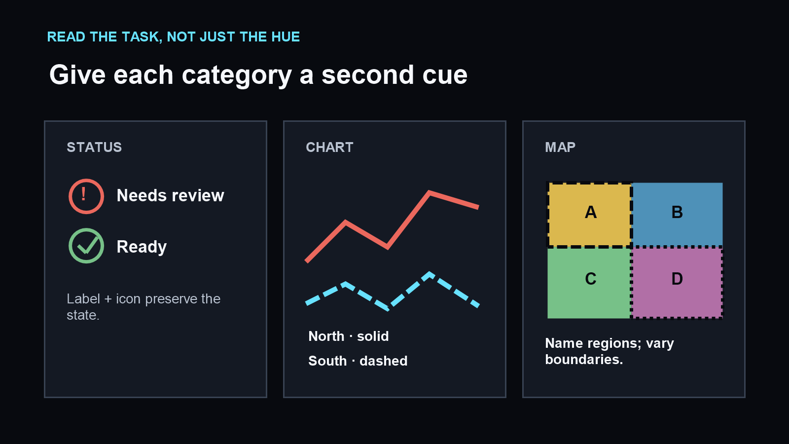
Try this now: use a status, chart, map, or photo that matters to your task. Check whether the important label, region, or series still makes sense when you ignore its color, then add a direct label, shape, pattern, or line style if needed.
Compare the patterns“Colorblind” does not usually mean seeing only black and white
Color vision deficiency covers different ways of distinguishing colors. The National Eye Institute describes red–green differences, blue–yellow differences, and complete color vision deficiency. Most cases make certain colors or shades harder to tell apart; complete absence of color is a separate and rare form.
That broad description does not tell you exactly how one viewer experiences a particular photograph, screen, or light. Two people with a similar label can still report different impressions, and a simulation cannot ask what a real viewer noticed.
Use the merged searches “what colors do colorblind people see,” “what can colorblind people see,” “what do color blind people see,” and “what color blind people see” as versions of the same question: which visual distinctions change, and what can a person still use to understand the scene?
Match the category to a real design task
The National Eye Institute’s types page, last updated August 7, 2023, describes several color-vision patterns. The task examples below are a site-authored way to inspect the same kinds of distinctions; they are not claims about what any one viewer will see.
| Type named by NEI | Color distinction described by NEI | Matched screen to inspect | Second cue to try |
|---|---|---|---|
| Protanomaly | Some reds can look greener and less bright. | A red warning beside a green ready state | State label and warning icon |
| Deuteranomaly | Some greens can look more red. | A status row or map using red and green regions | Named region and different boundary pattern |
| Protanopia or deuteranopia | The red–green distinction can be absent. | A chart whose series are separated by red and green | Direct series names, marker shapes, or line styles |
| Tritanomaly | Blue–green and yellow–red differences can be difficult to tell apart. | A route map with adjacent blue and green paths | Route name, dashed line, and labeled stops |
| Tritanopia | Blue–green, purple–red, and yellow–pink differences can be difficult to tell apart; colors may look less bright. | A map legend or status key using those pairs | Letters, text labels, and distinct symbols |
| Complete color vision deficiency | Color is not seen; NEI describes this form as rare. | A grayscale status table with meaningful states | Words, icons, line styles, and position |
Use these pairings to decide what to inspect, not to predict a person. The National Eye Institute’s descriptions are broad category summaries; a simulation remains a model-based transformation of your chosen image.
Start with the distinction the task depends on
A color name is not the task. A reader might need to tell whether an alert needs action, follow one line through a chart, or choose a region on a map. Record the decision first, then look for a second cue that carries the same meaning without hue.
| Scene or component | Question to ask | Second cue to check |
|---|---|---|
| Status or alert | Which item needs action? | Label, icon, border, or pattern |
| Chart | Which line belongs to the selected series? | Direct name, dash style, or marker shape |
| Map or diagram | Which route or region should be followed? | Text label, line style, boundary, or texture |
| Photo or illustration | Which object or detail matters to the task? | Outline, position, lighting, or a written description |
Color may remain useful. The check is whether color carries the only usable signal. If the task disappears when you ignore a hue, add another signal where the decision happens.
What a simulator can show—and what it cannot
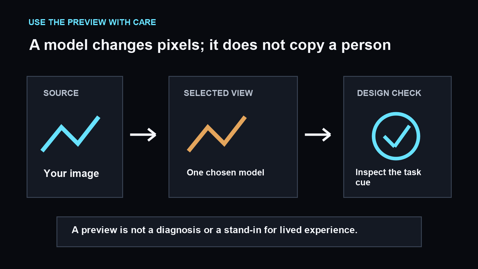
A simulator applies a selected mathematical model to the pixels in your source image. The result can help you spot places where a chosen preview makes a distinction look weaker or different. The National Eye Institute’s descriptions explain broad categories; the preview is a separate design tool that transforms an image.
Different models or settings can produce different previews. This site pairs each simulation with the source and a grayscale Difference map. Difference shows where this transform changed pixels; it does not reveal what a person sees or decide whether the design works for them.
Keep the image, crop, viewing size, selected view, and method fixed when comparing a repair. When two previews disagree, record the disagreement as uncertainty and make the design cue clearer across both. Do not select the output that looks most reassuring.
Observed run: the same status table under three models
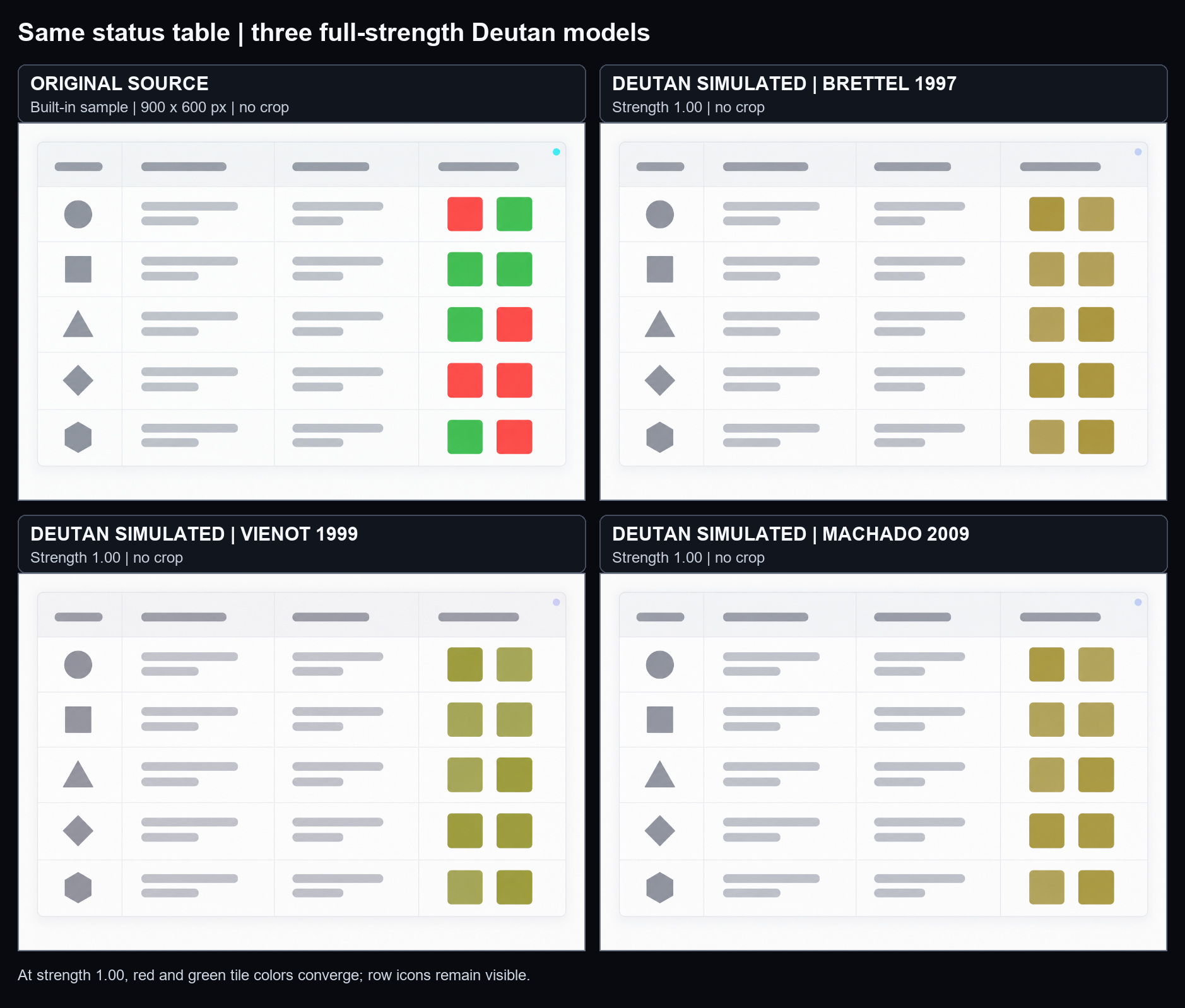
On September 26, 2026, I opened the simulator’s built-in status table. The tool reported a 900 × 600-pixel source image; I used it uncropped and selected only Deutan. In the browser viewport measured for this run (1438 × 824 CSS pixels at device-pixel ratio 1), the result pane displayed the image at 314.67 × 209.78 CSS pixels. I compared Original, Simulated, and Difference without changing the source or view.
| Fixed view | Method and strength | What appeared in this run |
|---|---|---|
| Deutan | Brettel 1997, 1.00 | The red and green status tiles shifted into a similar ochre family; the two color groups no longer looked distinct. Row icons kept their original shapes. |
| Deutan | Viénot 1999, 1.00 | The status tiles appeared olive; the red-versus-green split was not visible. Row icons kept their original shapes. |
| Deutan | Machado 2009, 1.00 | The status tiles appeared in a similar ochre family to the Brettel output; the red-versus-green split was not visible. Row icons kept their original shapes. |
| Deutan | Brettel 1997, Viénot 1999, and Machado 2009, each at 0.50 | Across all three previews, red-source tiles appeared orange or rust and green-source tiles appeared olive or green. The two color groups remained visually distinguishable in this screenshot; their shades varied modestly by method. |
To repeat it, open the simulator and choose Open this sample in the simulator. Leave Deutan checked and the other views unchecked. For each listed method, inspect strength 0.50, then strength 1.00; keep the sample uncropped and the browser viewport at 1438 × 824 CSS pixels. Compare the same status tiles in Original and Simulated, and check whether the row icons still identify rows. Do not compare Difference-map brightness between cards: each map is scaled separately.
In this run, raising strength from 0.50 to 1.00 removed the visible red-versus-green color split in the ten status tiles (two tiles in each of the sample’s five rows). Switching methods at strength 0.50 changed shades but did not change that visual grouping. This is an observation of one model-based preview, not a report about what a person sees or a pass/fail accessibility result.
Controlled example: make a chart readable without hue
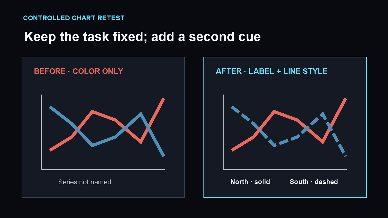
Imagine a chart with two lines distinguished by color alone. First, note which line answers the reader’s question. Keep the source and task fixed, then inspect the selected preview. If the lines merge or are difficult to track, add direct names and use different dash or marker styles.
Run the revised chart through the same view at the same size. Check whether the series can now be followed by its label and line pattern while color is ignored. This is a site-authored method example; it is not a user study and does not report what a participant saw.
A historical image set is a set of examples, not a universal view
A ColorJack archive dated 2007 listed nine named category images on one color-vision page and included a “Customaly” option for a user-defined simulation. That record describes how the archived tool organized its examples. It does not establish what any one person sees or make its images a substitute for lived experience.
The practical takeaway is to label a preview with the view and method used. Avoid presenting one image as “the colorblind view.” If a design matters to people’s decisions, combine model-based inspection with feedback from people who use it.
Repeatable check for a real screen
- Name the decision: what must the reader find, follow, or understand?
- Choose a representative source image and keep its crop and display size fixed.
- Record the selected vision view, model, and severity setting.
- Inspect the original, preview, and Difference map together.
- Add text, shape, pattern, position, or line style where color alone carries meaning.
- Repeat the same check and note any model disagreement.
This record says what the chosen preview showed under one setup. It should not be generalized into a claim about every person with that label.
Sources and limits
The National Eye Institute describes color vision deficiency as differences in distinguishing colors, outlines several broad types, and notes that complete absence of color is rare. Those statements describe general categories, not the vision of a particular reader.
Google US natural search results were checked in the signed-in Chrome profile on September 26, 2026, against color-blindness.com, pilestone.com, and daltonlens.org. The visible result snippets covered definitions, subtype examples, simulation tools, and model explanations. Snippets were used to check topic coverage; competitor pages were not treated as fully read clinical sources.
The status, map, and chart examples and the repeatable check were created for this site. The archived ColorJack image catalog is included only as a dated example of one tool’s categories. A model-based preview is not a diagnosis, a guarantee of accessibility, or a recreation of an individual’s vision.