Keep a chart mark findable after the colors move apart
Color Blind Friendly Palette: Check the Layout Before Release
Quick answer
A color blind friendly palette is useful only when the reader can still follow each mark in its real position.
Start with the token table below, then compare the same colors as neighboring swatches and as marks spread across the chart or interface. If a category becomes hard to track in the spaced layout, keep its label, shape, or pattern beside the color and retest the actual screen.
Do this now: choose the two categories a reader most needs to distinguish, place them at their real positions, and check that the meaning survives when hue is ignored.
Run the layout checkColorblind friendly colors need an adjacent and a spaced check
A row of touching swatches answers one question: can these colors be told apart when they sit beside one another? A chart asks another: can the reader find the same series when its marks are separated by space, labels, or other data? Keep the palette fixed and change only the layout between those two views.
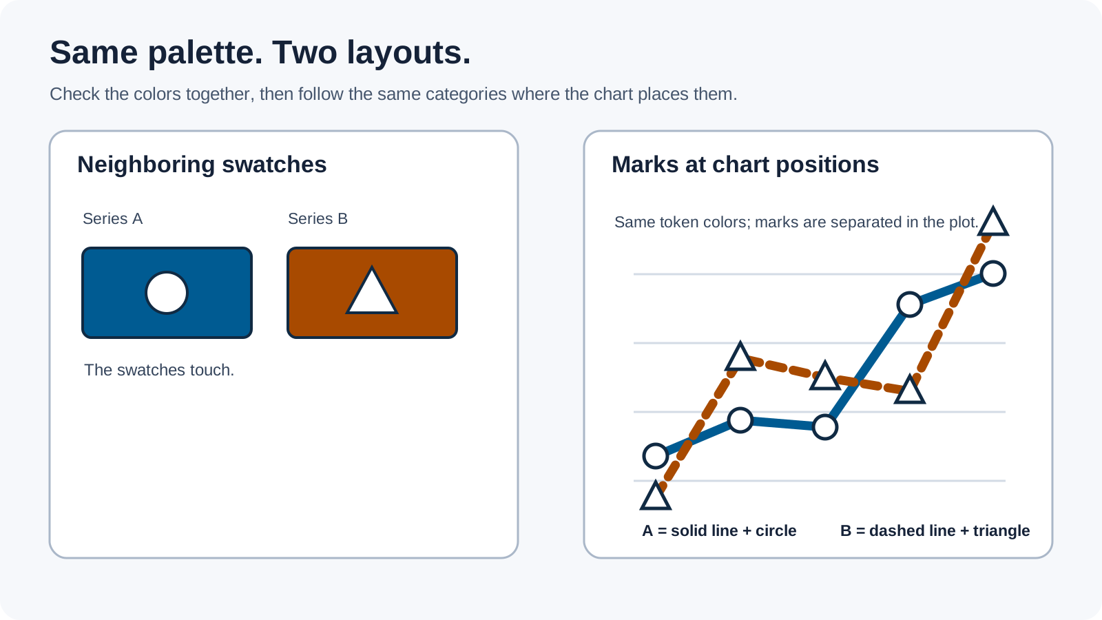
- Place the critical colors together in a compact legend row.
- Move those same colors into the chart positions where the data will appear.
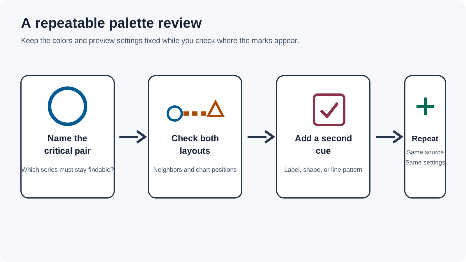
- Preview each layout with the simulator's Protan, Deutan, Tritan, and grayscale views.
- If the spaced view is harder to follow, add a direct label, marker shape, or line pattern to the affected series.
- Repeat the comparison with the source, scale, and view settings held constant.
This is a design review, not a claim that one palette works for every person. A simulation is a model-based preview. It can reveal a possible collision; it cannot reproduce an individual viewer's vision.
Colorblind friendly colors: copyable tokens for four interface states
The site-authored starter palette below assigns each state a color and a separate marker. The patterns and labels carry the category if the hues converge. The HEX values are sRGB CSS tokens prepared for this 2026 interface example; the names describe the role in this sample, not a universal color meaning.
| State token | HEX fill | White label | Second cue | Example copy |
|---|---|---|---|---|
| Ready | #005B92 | READY | Circle with a solid outline | Ready to review |
| Review | #A84A00 | REVIEW | Triangle with diagonal lines | Check this item |
| Blocked | #8A344B | BLOCKED | Square with a crosshatch | Action is required |
| Needs input | #006B54 | NEEDS INPUT | Diamond with a dotted edge | Waiting for a reply |
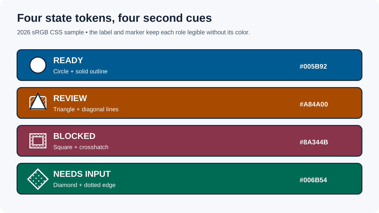
Use these as a colorblind friendly color palette for a prototype, then check each token against the actual background and neighboring states. This is a color blind friendly color palette only for this sample interface, not a universal set. Keep the state word visible; do not make the color swatch the only legend key.
Colorblind friendly palette hex values with a stated contrast scope
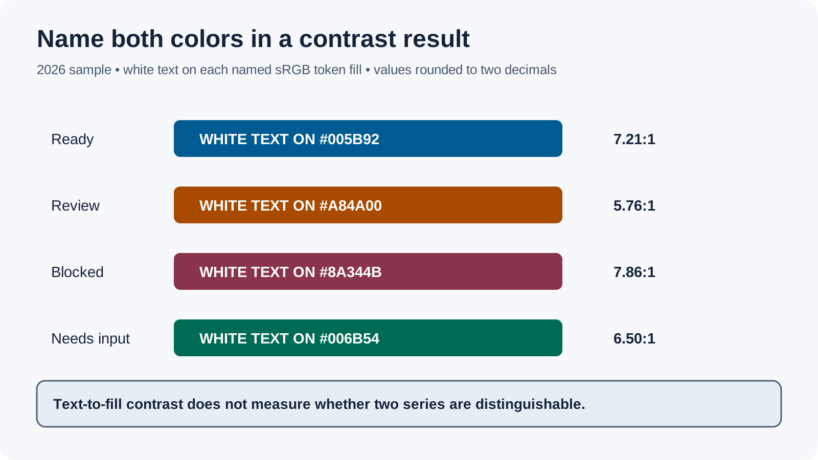
For the 2026 sample above, the white text contrast ratios were computed from each token's sRGB value against a pure white text foreground on that colored fill. They are 7.21:1 for Ready, 5.76:1 for Review, 7.86:1 for Blocked, and 6.50:1 for Needs input. Those ratios apply only to these specified foreground and fill pairs; they do not measure whether two data series look different from one another.
If you searched for color blind friendly palette hex values, the table gives the CSS token and text scope together.
Use the correct WCAG contrast check for each mark
WCAG 2.2 Success Criterion 1.4.3 sets a 4.5:1 minimum for normal text and 3:1 for large text. Criterion 1.4.11 uses 3:1 for meaningful non-text graphics against adjacent colors. Apply the criterion for the actual element and inspect thin marks at their actual size; a passing text-to-fill ratio does not make a color-only key sufficient.
These 2026 token ratios use the WCAG relative-luminance method with unrounded intermediate values and display the results rounded to two decimal places. The stated white-text and fill pair is part of each result; the ratios do not measure distinction between different data colors.
A color blind safe palette still needs the cue that identifies each state
In the table, the label says what the state means, while the marker gives it a shape or line treatment that can be followed without a color name. Keep the cue attached to the item: put a short label on or beside a line, use a distinct marker at plotted points, and place the state text inside a status row.
For a design review, turn off or cover the fills temporarily. If a reader can still identify Ready, Review, Blocked, and Needs input from the text and marker alone, color adds emphasis without carrying the whole decision. Restore the fills and verify the same items in the spaced layout.
Controlled example: a legend swatch can pass while its chart series gets lost
Imagine two series shown as blue circles and orange triangles. In the legend, the swatches sit together and are easy to compare. In the chart, the same circles and triangles may appear at distant points among other marks. Keep the colors and the preview setting fixed; compare whether the reader can track each series in both arrangements.
If the distant marks blend into the surrounding data, add a direct series label or repeat the shape distinction at each point. Then review the same chart again. This site-authored example describes a repeatable inspection; it is not a user study or a guarantee for all displays.
Build a data visualization color blind friendly palette around the data type
Use separate design decisions for categories, ordered values, and values that diverge around a meaningful midpoint. For categorical series, give the critical series both a color and a repeated shape or line style. For an ordered scale, make the change in value readable in grayscale and label important thresholds. For a diverging scale, mark the midpoint and label the direction on both sides.
This is a role-based starting method for a chart, not a claim that the same shades suit every dataset. If the figure depends on small or distant marks, check the exact output size and the final legend placement.
Choose a hue relationship before testing the layout
Named hue-wheel relationships such as analogous, complementary, split-complementary, triadic, and tetradic can help form candidate swatches. For this 2026 hue-wheel example, a Clash relation uses a 45-degree offset; that value describes the formula's hue step, not an accessibility threshold. Hue, saturation, and balance are the three starting controls. After choosing candidate colors, hold them fixed and check whether the same category stays findable in neighboring swatches and at its chart positions.
Use a color blind friendly palette generator as a first draft, not the final check
A color blind friendly palette generator can suggest candidate swatches quickly; a colorblind friendly palette generator serves the same first-draft role. Before using its output, write down the category each token represents, check text and graphic contrast against their actual neighbors, and test both the legend and the chart layout. A saved palette file does not encode where labels, patterns, or markers must appear.
To compare this article's colorblind friendly color palettes with a generated set, keep the series names and chart layout unchanged. Replace only the color values, then repeat the same simulation views and note which version keeps the critical pair easier to follow.
A small worksheet for color blind safe colors
| Record | Before release |
|---|---|
| Decision carried by color | ____________________________ |
| Critical pair or series | ____________________________ |
| Legend layout and chart positions | ____________________________ |
| Text/fill pair and contrast result | ____________________________ |
| Preview view and settings | ____________________________ |
| Label, shape, or pattern added | ____________________________ |
| Result in the spaced layout | ____________________________ |
Record the tested color values, backgrounds, actual display size, and preview setting. A changed layout or text/background pair needs its own check.
Scope and common questions
This color blind friendly palette is a site-authored sample for interface states and data marks. Its contrast values are calculated for the stated white-text/fill pairs using the WCAG relative-luminance method; its simulation step is a visual review, not a pass/fail certification. The colors may need adjustment for a different background, display, role, or data set.
For text, follow the applicable WCAG text contrast criterion. For meaningful graphical objects and controls, check the adjacent colors under the non-text contrast criterion. Neither check guarantees that two separated series remain distinguishable, so keep direct labels and non-color markers in the design.
Can I use color blind friendly colors without labels?
Do not rely on color alone when it signals a state or category. A visible word, shape, pattern, or line style can carry the same meaning.
Are colour blind friendly colour schemes automatically accessible?
No palette is a universal pass. Test the critical items in their real positions, check the applicable contrast requirement, and include a second cue.
Where can I find a color blind friendly palette generator?
Use a generator to explore candidate hex codes, then bring the result into the interface or chart where it will be used and repeat the layout check.