Deuteranomaly: A Spectrum, Not a Three-Level Score
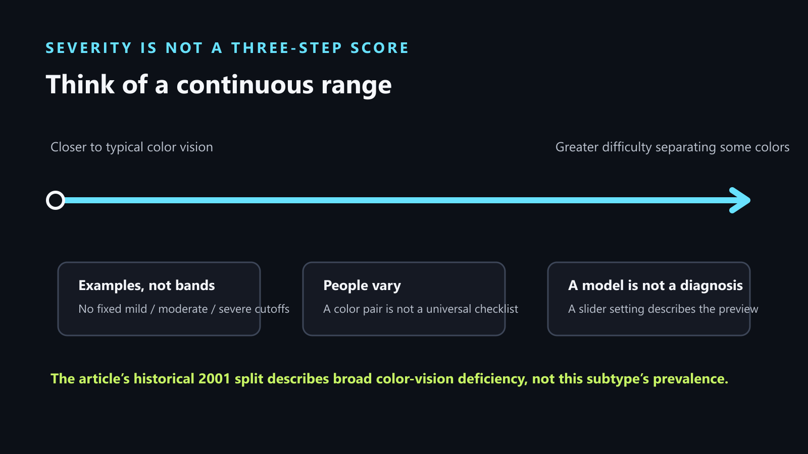
Deuteranomaly is a green-weak form of red–green color-vision deficiency. Its effects can range from close to typical color vision to substantial difficulty separating particular colors. There is no three-band severity rule here that lets an online score tell you where you fall. The simulator on this site can help you inspect a color-coded image; it cannot test or diagnose your eyesight.
If you are checking a design, use the repeatable review below and judge the task, not a color name. If you are checking your own vision, treat an online result as a reason to ask an eye-care professional—not as a diagnosis or a pass.
This guide also covers the searches “deuteranomaly color blind” and “mild deuteranomaly,” with the same focus on how color differences affect a real task.
What “mild” and “severe” can—and cannot—mean
Color-vision deficiency is a continuum. In the 2001 broad-colorblindness description, one in four people described as colorblind is a dichromat; the rest are anomalous trichromats. Anomalous trichromats have color vision that is better than dichromats but not as good as normal; dichromats see only two hues. This split is not a three-step mild, moderate, severe scale, and it is not a deuteranomaly-specific prevalence estimate.
For anomalous trichromats, olive green may be confused with brown. Saturated magenta and blue-green can still be visible, while light pink or a pastel blue-green may be hard to separate from white. These are examples, not a checklist every person will match.
At the dichromat end, the rainbow reduces to two broad hues, approximately yellow and blue: red, orange, yellow, and green collapse toward one yellow-like group, while the other half appears blue. The spectrum between blue and green—including aqua and turquoise—may look gray or white. “Two hues” does not mean every scene becomes two flat paint colors; brightness and gray can still vary.
A careful way to check a real image
This site’s tool checks a design image, not the person holding the phone. Use this sequence when the question is whether a screen, chart, map, status panel, or photo still communicates its meaning under a deutan preview.
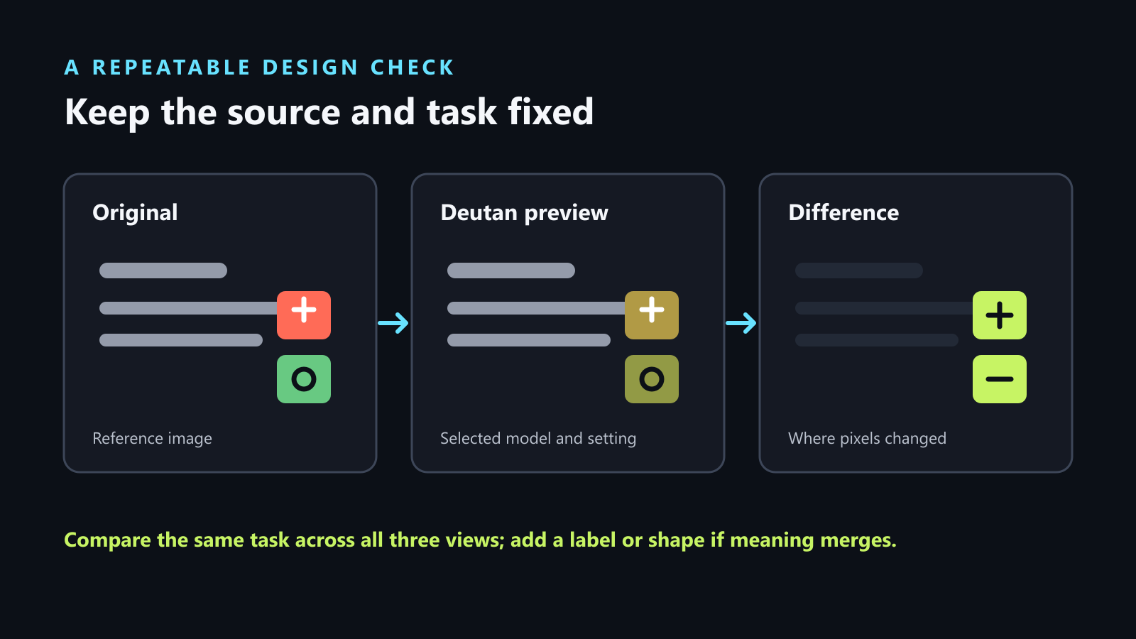
- Name the decision. Write what the viewer must identify: a status, a warning, a chart line, or a map region. Pass: you can state the task in one sentence before opening the preview.
- Choose the example. Open the built-in status table, or load one representative JPEG, PNG, or WebP image. Pass: the same source image and crop will stay in place throughout the comparison.
- Set the preview. Select the Deutan view, then choose a method and severity setting from 0 to 1. The current tool offers Brettel 1997, Viénot 1999, and Machado 2009. Pass: record the method and setting so the comparison can be repeated; the slider value is a model setting, not a measurement of your eyesight.
- Read all three panels. Compare Original, Simulated, and Difference. Check the actual task: can you still tell which status needs action, follow the line, or locate the region? Pass: meaning remains identifiable without relying on hue alone. Needs a repair: two important states merge or a color-only mark becomes hard to track.
- Add a second cue and repeat. Add a direct label, icon, shape, border, pattern, position, or line style. Keep the image, method, and setting fixed, then repeat the same task. Pass: the decision can now be made from the added cue even if the colors look alike.
The Difference panel is auto-scaled for each result. Compare where a single map changes; do not compare brightness between separate Difference panels as if it were a severity score.
A useful record is: task → image and crop → Deutan method and setting → what became hard to distinguish → second cue added → result after the same task was repeated. That record says what happened in this design review. It does not assign a clinical label to the person who ran it.
If you are checking your own vision
There is no “pass” on this website for a person’s eyesight. The simulator transforms uploaded pixels using a selected model; it does not measure what you see. If color confusion is affecting school, everyday choices, or a job you are considering—or if color-vision deficiency runs in your family—ask an eye-care professional about a standardized color-vision assessment. Bring the question that prompted you to check. Do not convert a slider value, a single plate, or a simulator result into a diagnosis or a severity category.
Why one test may not settle the question
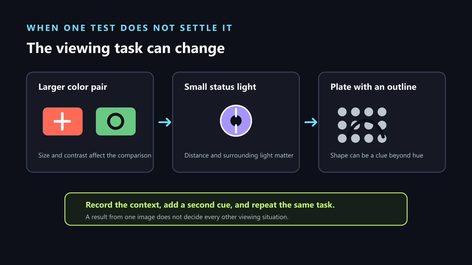
A real-world color pair and a tiny status light are different viewing tasks. Someone may readily tell two larger red and green samples apart yet be unsure whether a small charging light is red, green, or orange. Size, distance, the surrounding image, display settings, and lighting can all change the task. A single successful comparison therefore does not establish that every smaller or lower-contrast signal will be easy to read.
A plate can also contain clues besides the intended color difference. If a row of dots forms a recognizable outline, a viewer may identify the outline even when the tested hues are difficult to separate. Another viewer may report no figure at all. That disagreement is a reason to be cautious about turning a single image into a severity score.
Quick answers about a deuteranomaly preview
Does the slider tell me how severe my vision is?
No. It sets a model-based preview of an image. It does not measure your eyesight or assign a clinical severity category.
Why might a large color pair be clear while a small indicator is not?
They are different viewing tasks. Size, distance, surrounding content, display settings, and lighting can change the comparison, so one result does not settle every situation.
What should I do if a color-only status is hard to follow?
Add a direct label, icon, shape, pattern, position, or line style. Keep the source image and preview settings fixed, then repeat the same task.
Where color discrimination may matter at work
Color-sensitive occupations include pilot, jeweler, graphic designer, photographer, electrician, ship’s captain, law-enforcement officer, and train engineer. They involve tasks where distinguishing colors may matter. This is a prompt to check the exact role’s requirements—not proof that every person with deuteranomaly is barred from every job on the list.
If you are considering one of these roles, ask the employer, licensing body, or training program what color-vision assessment applies before you make a career decision. The list alone cannot answer “Will I be disqualified?”; the answer depends on the specific role and its current standard. A personal assessment is the right next step when eligibility matters.
Why a U.S. “go” signal can look blue-green
A blue component has been used with the green “go” signal—or in some designs in place of green—to make it easier to distinguish from red for people with red–green color-vision deficiency. That does not mean every signal looks blue-green to every observer. Some dichromats may see the “go” light as gray or white, so the intended color cue is not universal.
Historical figures: keep their scope attached
The broad 2001 estimates are one in 12 men and one in 230 women. They are historical figures, not current rates or deuteranomaly-only estimates. Keep that scope attached; do not turn the ratios into a present-day personal probability.
Try the design check
Open the color vision simulator. Load the built-in status table or one image you actually use, select Deutan, and follow the same task through the three panels. If meaning gets lost, add a non-color cue and repeat the check with the same image and settings.